A grocery store is a carefully engineered environment designed for one primary purpose: to get you to spend as much money as possible. Retail psychologists have spent decades studying consumer behavior, and they use that knowledge to create a store layout filled with subtle tricks that push you to overspend. These strategies are designed to appeal to your subconscious, disrupt your plans, and encourage impulse buys. Here are five of these clever layout tricks that you may not have noticed before.

Image Source: pexels.com
1. The One-Way Aisle Illusion
Have you ever noticed how some aisles seem to have a natural, one-way flow? Stores will often place large, attention-grabbing displays or promotional bins on one side of an aisle. This subtly encourages you to walk down the aisle in a specific direction. It also makes it feel more difficult to turn your cart around and go back, which means you are more likely to continue walking forward, past even more products you did not intend to see.
2. Sensory Marketing with Music and Lighting
The background music in a grocery store is not chosen by accident. Studies have shown that stores that play slow, calming music encourage shoppers to slow down their pace, spend more time in the store, and ultimately buy more. Similarly, the lighting is strategic. Retailers use bright, high-intensity lighting in the produce section to make the fruits and vegetables look fresher and more appealing.
3. The Dairy Section “Wall of Cold”
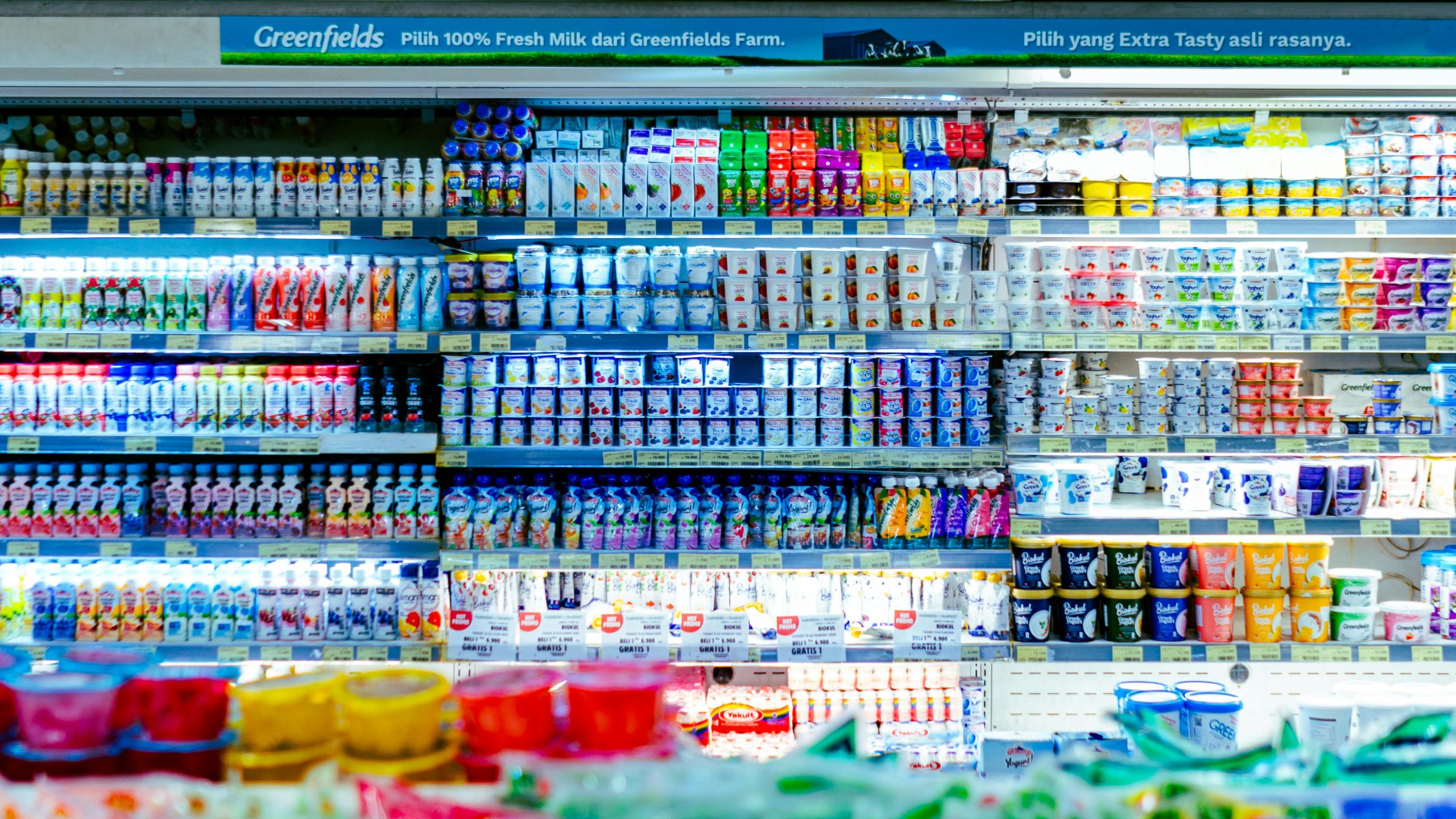
Image Source: pexels.com
The dairy aisle is almost always a long, open wall of refrigerated cases. This creates a literal “wall of cold” that can be physically uncomfortable for shoppers. This subtle discomfort can cause you to rush your decision-making process. Instead of taking the time to compare prices, you are more likely to quickly grab the familiar, brand-name milk or cheese that you recognize, which is often the more expensive option.
4. Placing Popular Items to the Right
Retail designers know that because most of the population is right-handed, shoppers have a natural tendency to look at and grab items on their right side. As a result, they will often place the more expensive, higher-margin national brand to the right of the cheaper store brand. This simple placement makes it just a little more likely that your automatic, right-handed grab will be the more profitable one for the store.
5. Creating a “Destination” in the Middle of the Store
To break up the monotony of the long aisles, many stores now create a “destination” or an “island” in the middle of the store. This could be an olive bar, a special cheese display, or a station for free samples. This forces you to stop and break your routine. While you are there, you are surrounded by high-margin, specialty items that are easy to add to your cart as an impulse purchase.
The Architect of Your Choices
Every step you take in a grocery store has been anticipated and planned by a retail designer. The layout is not designed for your efficiency; it is designed for the store’s profitability. By becoming aware of these subtle but powerful psychological tricks, you can take back control of your shopping trip. You can learn to see the store for what it is and focus on buying what you need, not what the layout wants you to buy.
Have you ever noticed any of these more subtle layout tricks in your local store? What do you do to resist the urge to make impulse buys? Share your strategies!
Read More
8 Products That Were Moved to Different Aisles to Trick You Into Buying
What Grocery Store Layout Changes Are Meant to Do to Your Brain?